As the second wave of lockdown seems imminent, or already is taking place, work from home resumes for many office workers across the world. Therefore, thinking about one’s own work from home (in short, WFH) becomes increasingly more important. The first wave taught us a lot about how to improvise a workspace, but for the second wave, we can look and search how to step up our home office workspace. Out of ideas? Don’t worry, because Budget Direct has got you covered.
Like most of us, you’ve probably had a chance to watch loads of movies by famous directors over the course of this tumultuous year. You may have noticed how distinct each and every one of their styles is. Sometimes it’s even easy to tell whose work it is just by looking at the scene.
And here we get to the crux of the story. Budget Direct did the research, and their talented digital artists have made some impressive 3D renders of home workspaces inspired by some of the most known directors’ signature scenes. If you’ve been looking for a little something-something to refresh your home office, look no further. With online shopping habits on the upswing, you probably won’t have that much of an issue getting the items that you need to nudge it in the desired direction without leaving your workspace, er… I mean home.
More info: budgetdirect.com.au
The Wachowskis
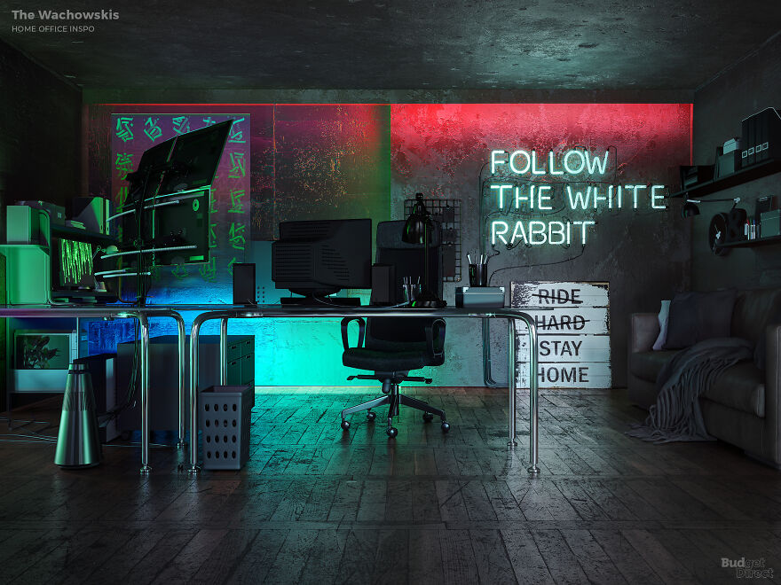
Image credits: Budget Direct
The Wachowskis shot to success and helped define our image of the 1990s with The Matrix, their second film. The movie and its sequels share a cyberpunk aesthetic that has become fun and iconic “just because—as it turns out—the internet age doesn’t really look like that. Well, it can if you want a Wachowskis-themed study.
Our Wachowskis office represents the collapse of everything. Spot the post-industrial fixtures and fittings, abandoned 1980s office furniture, and repurposed wood and signage. The Matrix home office makes a cool DIY project for an upcycle with imagination.”
Sofia Coppola
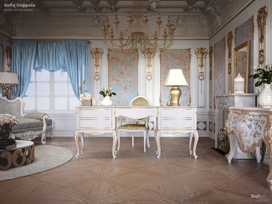
Image credits: Budget Direct
“Interior-wise, Sofia Coppola is best known for the dark, deluxe modernism of the hotel suites in Lost In Translation. But picture-for-picture, Coppola has developed a soft-focus vintage look populated with pastel colors and an eye for exquisite bling.
Sure enough, Coppola’s own home look is pale and fey. “My apartment is pretty calm and restrained,” says the filmmaker. ‘I like a clean white backdrop set off by masses and masses of pink peonies.’ We’ve erred towards Coppola’s professional aesthetic: a vintage dressing table desk, baroque curves, and plenty of baby blue and gold.”
Wes Anderson
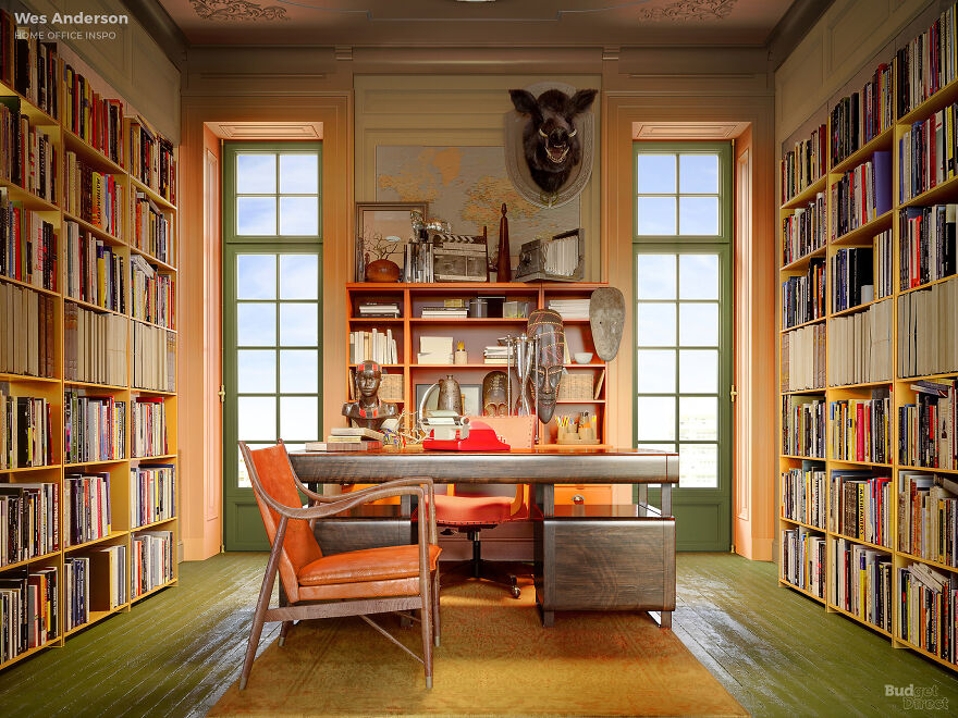
Image credits: Budget Direct
“Wes Anderson becomes less of a filmmaker and more of a designer with every film he makes. Today, the Rushmore director is the ultimate architectural filmmaker. Anderson shapes his film sets’ space with symmetry and flat composition to present his characters in a world that is part theatre stage and part expressionist dream world.
Our Wes Anderson home office dials it back to The Royal Tenenbaums era. We’ve combined organic colors and curated clutter with meticulously angled furniture. The back wall says, ‘this is where I’ve been.’ The books and records say, ‘this is who I am.’ And that vintage desk, aimed squarely at visitors, says, ‘looks like I’m here to stay.'”
Bong Joon-ho
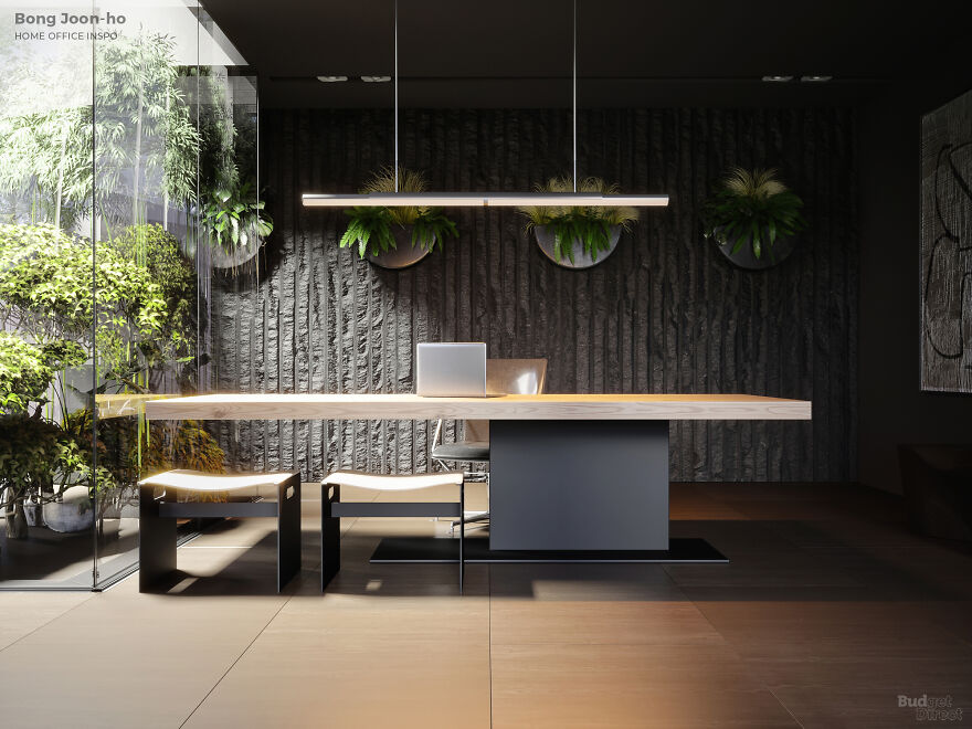
Image credits: Budget Direct
“Korean director Bong Joon-ho achieved international fame in 2019 when Parasite became the first non-English-language film to win an Oscar. But cultured film-lovers were already familiar with his work, from the cool, satirical Memories of Murder to the Kubrick-tinged sci-fi of Snowpiercer.
Joon-ho’s diverse filmography has not prevented him from developing a consistent visual style. Glassy modernism with a hint of the wild is the way to go, with careful attention to light sources: large windows with natural light, glowing screens, and statement fittings. “Accidental” geometry and textured surfaces add a touch of class.”
David Lynch
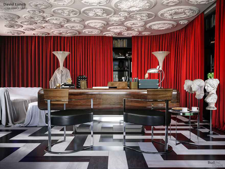
Image credits: Budget Direct
“Of course, we know exactly what David Lynch’s home office looks like, thanks to the Twin Peaks creator’s daily Weather Reports. And it sure looks Lynchian. However, if you’re after something with a bit more space and color, you’re better off taking a cue from his films.
Yes, Lynch’s first features were black and white, and Dune—although a color movie—was obsessed with black. But since Blue Velvet, the filmmaker has shown us how to make basic prime colors equally stylish and creepy. To get that extra-dimensional look, start with the Twin Peaks red room, add a little 1950s Americana, and record your voicemail greeting backward.”
Pedro Almodovar
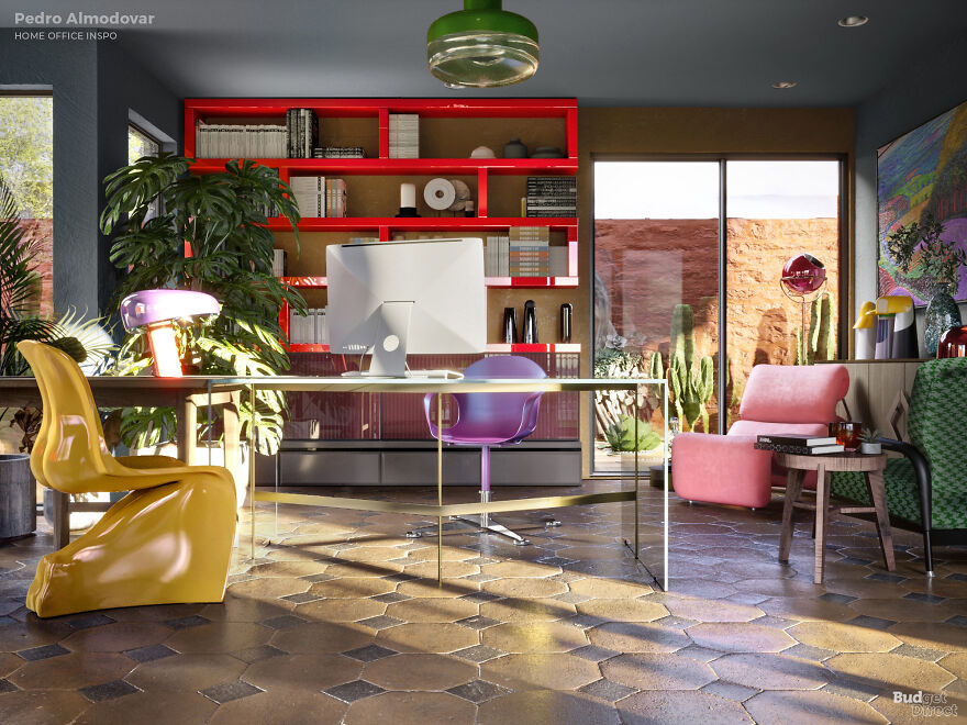
Image credits: Budget Direct
“’I wanted a pop-art kind of set, with pastel colors,’ says Spanish film director Pedro Almodovar of his 1988 breakthrough, Women on the Verge of a Nervous Breakdown. “If I’d had the money and the contacts, I would have asked David Hockney to design it.” But in the three decades and 14 features since then, Almodovar’s aesthetic has become unattributable to any artist but himself.
The pop-art element is still there, but Almodovar’s looks both swarthy and slick, raw, and pushed to the excesses of sophistication. The interior design in his latest, Pain and Glory, demonstrates the filmmaker’s over-the-top philosophy: if every element sticks out, no element sticks out. For our Almodovarian home office, that means the unifying principle is “anything goes”—as long as it’s fabulous.”
Jean-Pierre Jeunet
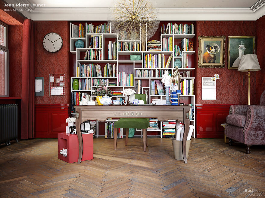
Image credits: Budget Direct
“Jean-Pierre Jeunet’s worlds aren’t always places you’d want to live and work. But his bitter bubble-gum sci-fi City of Lost Children and post-apocalyptic odd-house comedy Delicatessen are as inventive as they are gloomy. With Amélie, Jeunet finally had homeowners reaching for the paint rollers.
Amélie took the grim visual motifs that made Jeunet’s films stand out, made them lovely, and applied them to a Paris coated in sepia. To design your own Amélie-style home office, start with a strict Christmas tree color scheme for the fixtures and fittings, and then trawl op shops, Etsy, and eBay to find objets d’art with a life of their own.”
from Bored Panda https://ift.tt/2IpFo4x


0 Yorumlar